
A picture says a thousand words
After having received another unusable promotional photo of an Artist, let’s talk about promo pics.
Here at Perth Open Mic, we’ve received all sorts of promo pics and if I’m honest, about half of them are not used, because they don’t do the job.
So here are some examples of elements you might like to reconsider:
If it’s obvious you’ve taken the photo in your bedroom.
If you’re looking at your phone. You’d be amazed how often this happens.
If you are hanging out with your mates or pulling a face.
Showing your whole body. In most cases we don’t need to see your feet.
If you’re a tiny part of a big picture.
If it generally looks like a photo you’ve chosen from your phone gallery.
Think about this stuff
Your photo is the only visual point of reference people have to go by. They look at it and make a decision (whether you like it or not) about how you sound and if you’re any good. Make some decisions on what the photo can be before you start snapping away. Hopefully it reflects, or at least doesn’t detract from how you sound.
Use the same picture all the time.
You may have got three or four great shots out of a photo shoot, so you decide you’ll use them all depending on how you feel. It’s not a great idea. You should you use one, everywhere, for like a year straight. This is branding, so don’t confuse the audience. They want to recognise you instantly and consistently.
Location
Make an effort. There are some fantastic promo shots in backyards and they look grungy and cool. Plan it though. Choose a look that you’re going for. Please no bedroom photos unless you’ve made a serious effort. If you’re dressed up, looking cool and framed well, the background can be irrelevant at times.
Lighting
Can we see your face? Should we be able to see your face? Are you squinting into the sun. This is always tricky in my experience.
Framing
Is there something or someone distracting in the background? Are we going for close up or the distant figure approach? There are plenty of great promo shots of dudes with guitars by their side and looking off into the distance. Don’t forget you’ll need something to crop for different platforms.
Clothing
No one comes to a gig and wants to be able to feel that the person on stage is just one of them. So choose your clothing well. Make it look like you could hop on stage at any time.
I personally don’t think there’s any place for logos on clothing in a promo pic.
Take many pictures and choose one.
You’ve got to just have a crack at some point. Most promo photos I’ve been in, aren’t the first angle and pose. Who knows? Maybe the blue sky above your head as you look down at a camera on the ground is the winner. Maybe the complete opposite, with you lying on the grass and looking up is best? Either way, get all your ducks in a row (location, clothing) to give yourself the best chance.
Conclusion
You don’t need to spend money, or use a good camera. But don’t bother sending through photos where you clearly haven’t thought about your image at all. Open mic is low on the totem pole of a music career, but it’s a vital step. Just like the stage time we offer, this is your chance to get your shit together before someone important pays attention to you. If we can’t use your promo photo, then they probably won’t give you a second look either.
Make it work for you.
Some examples of promo pics sent to Perth Open Mic.
This is too dark. Great clothes, cool pose, good background, but way too dark for use.
This is how you’ve chosen to show your music to the world?!! I didn’t really need to cover the artist’s face because he’s looking down anyway. A foreground of literal trash, poor framing, regular street clothes. When you consider he could have sat on the ground behind him and taken any photo to achieve a better result. Ok, so this clearly wasn’t taken as a promo pic. But then it shouldn’t have been sent to us to use as one.
This is interesting. It’s too cool to use in my opinion. It could be anyone. We didn’t even need to disguise their face! Might not even be a guitar…? Very cool setting, but there’s nothing there to help the audience figure out anything about the artist. Yeah, we may hate having to put a picture on our sound, but this is unusable.
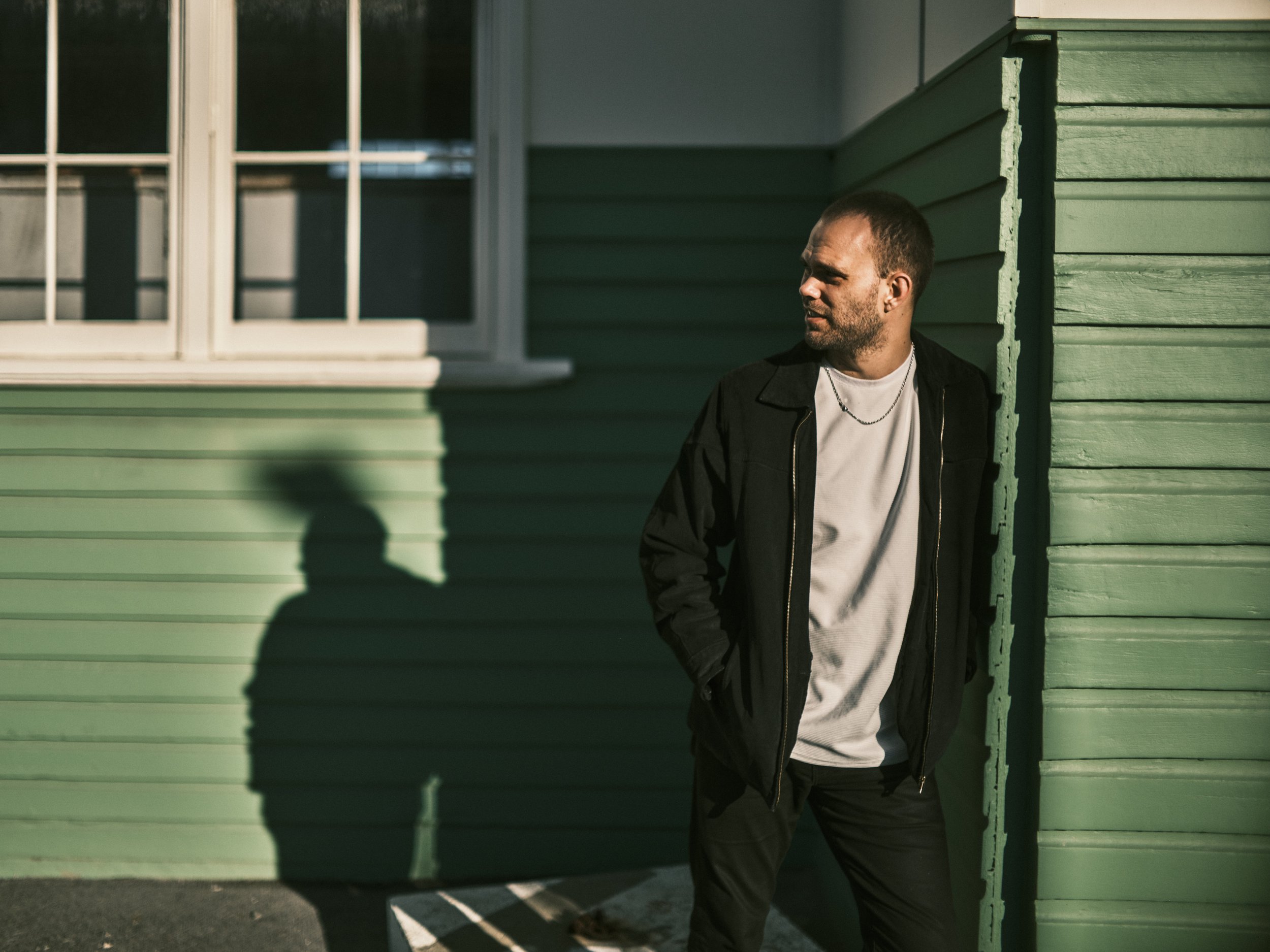
I think this is great. Cool clothes, interesting but not distracting background with a single colour scheme. Shadow is cool. Good framing.
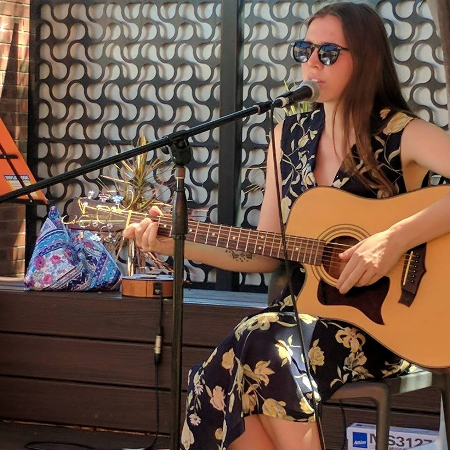
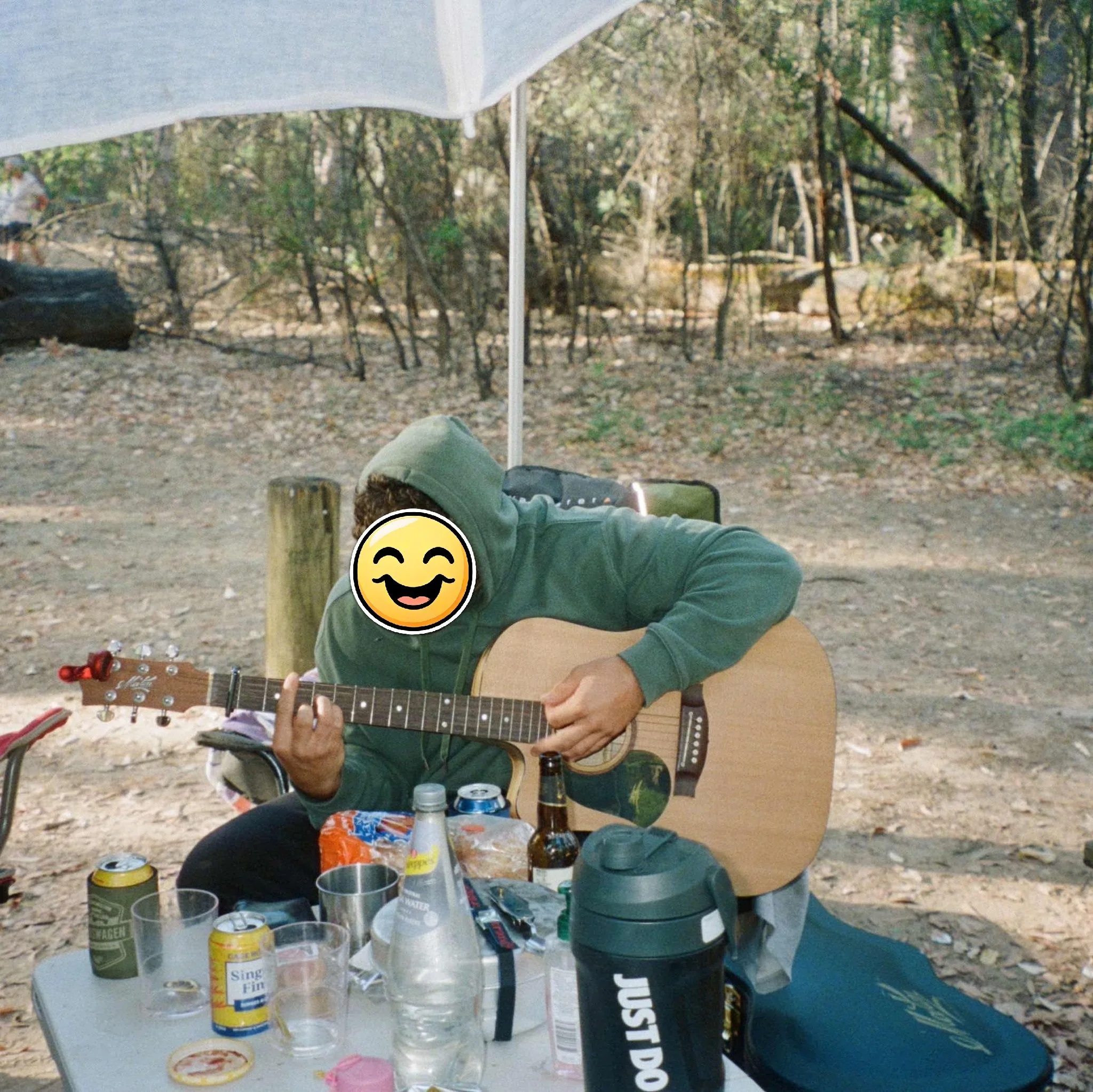
Stage shots are good and this one is pretty cool. The sunglasses are cool, nice outfit and background. I just wish stage shots didn’t contain non-stage related stuff. My eye is drawn to the white box under the chair and the orange file on the music stand. I may be wrong here, but I find that distracting. Maybe with a bit of cropping this would work better?
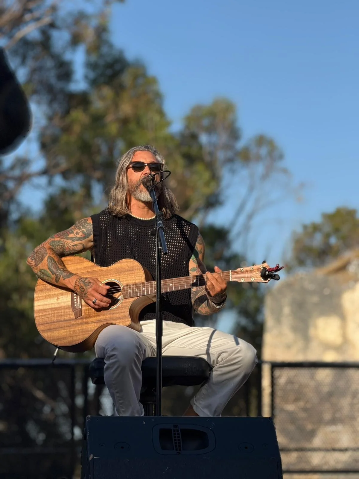
I like this stage shot. Dude looks cool, lighting is great. Out of focus trees look great. The gig looks like it’s important. Nothing distracting in the shot. I think it could be cropped for better framing of the Artist though.
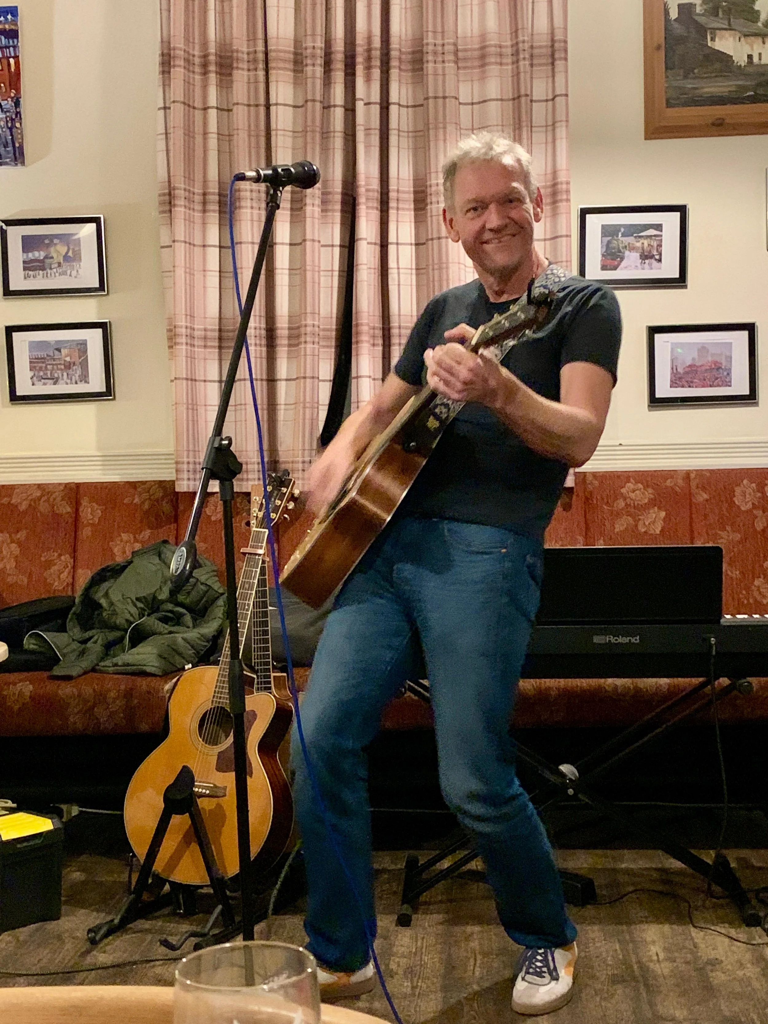
Sorry mate. A bit too casual. Good for your socials feed, but not a promo pic. Unless you cropped it better, but it’s a bit grainy already.
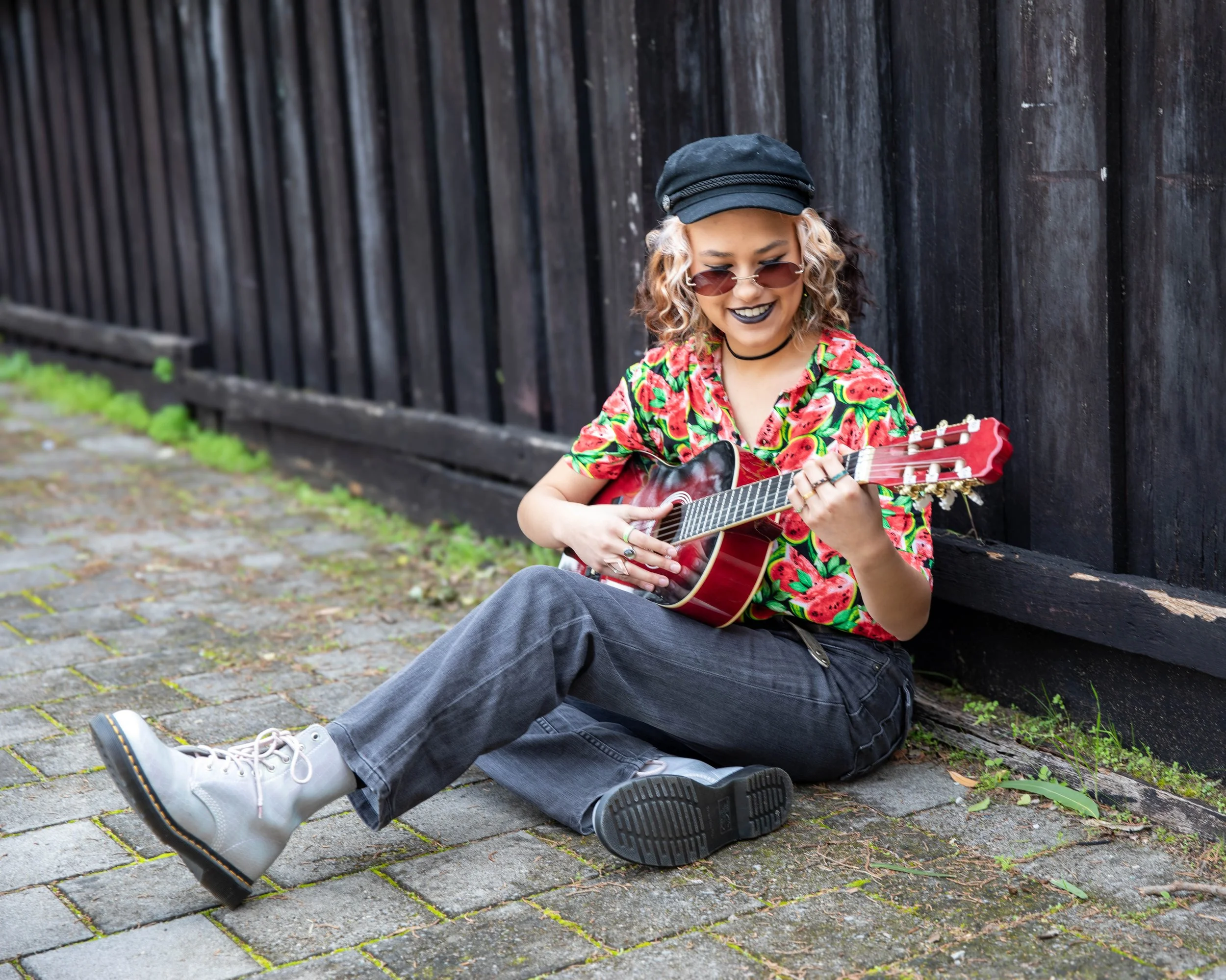
I think this is a great example of how you don’t need an exotic location or fancy camera to capture the essence of an Artist. Great outfit, big smile and very effective promo shot for a fledgling artist. Gritty, real. Love it.
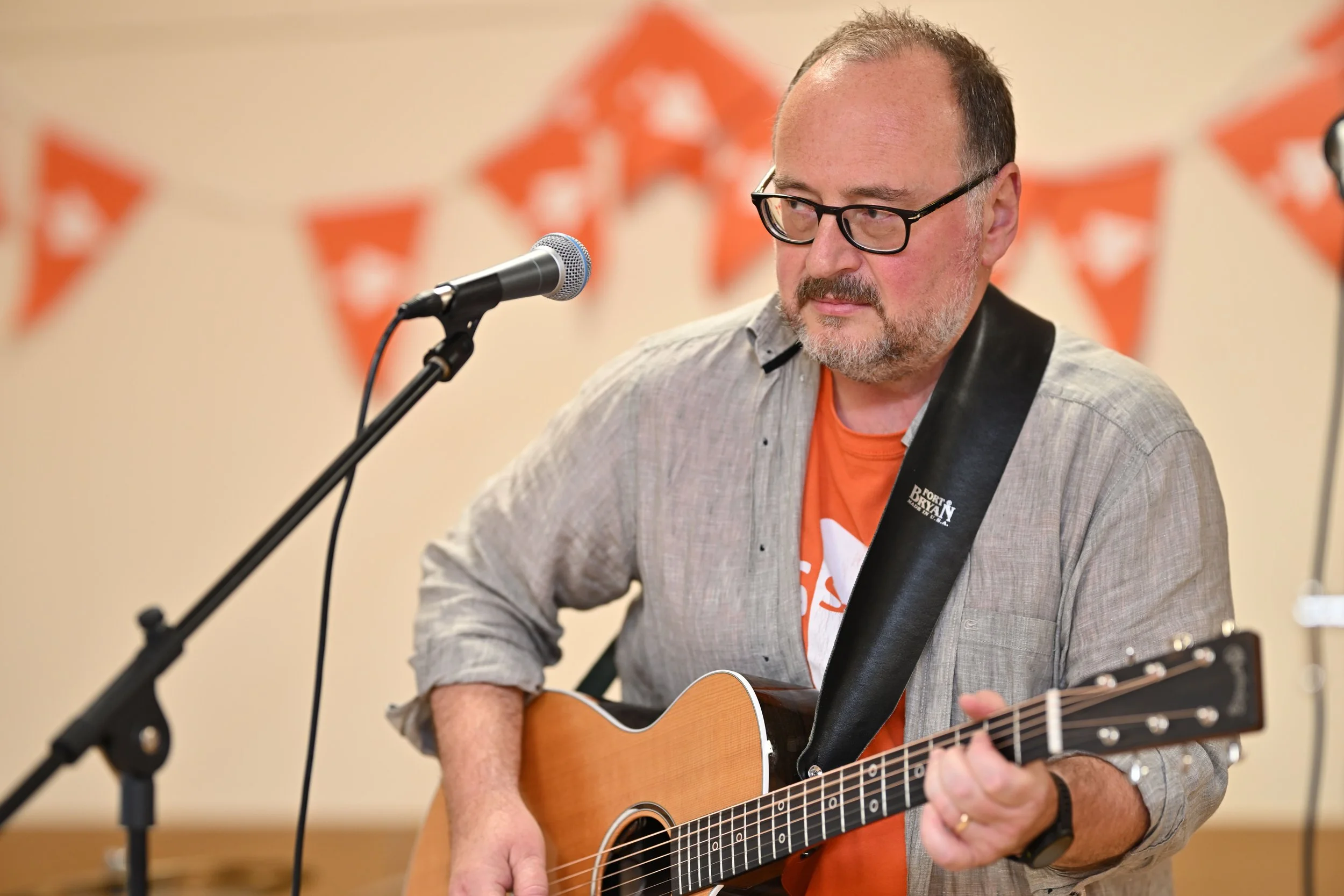
I don’t see anything wrong with this. His shirt matches the bunting. Stage shots are cool because they show the viewer that you’ve done this before. I just wish people wouldn’t leave mic cables dangling like that though.
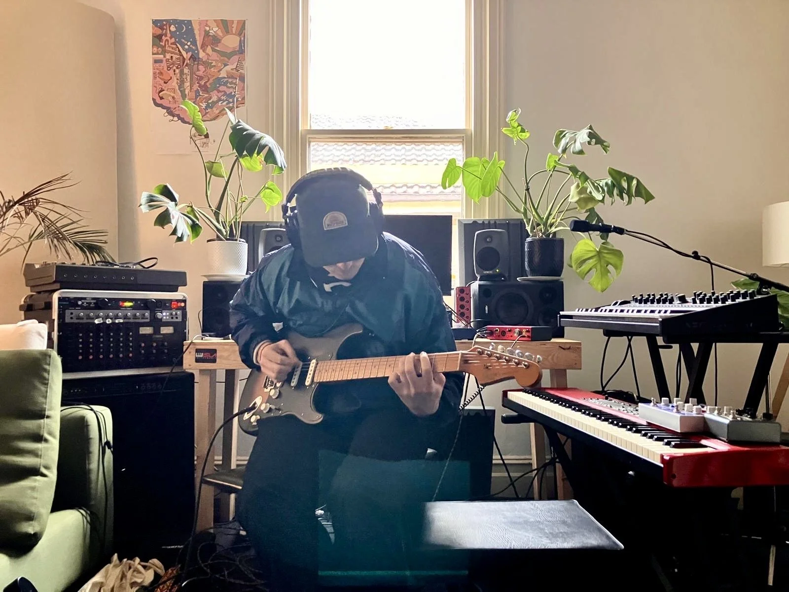
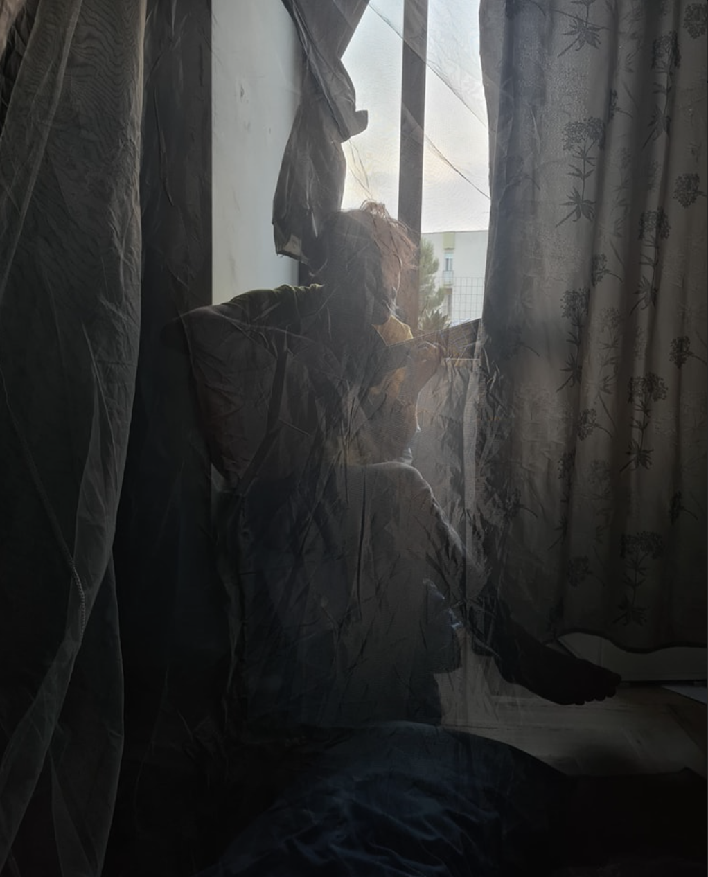
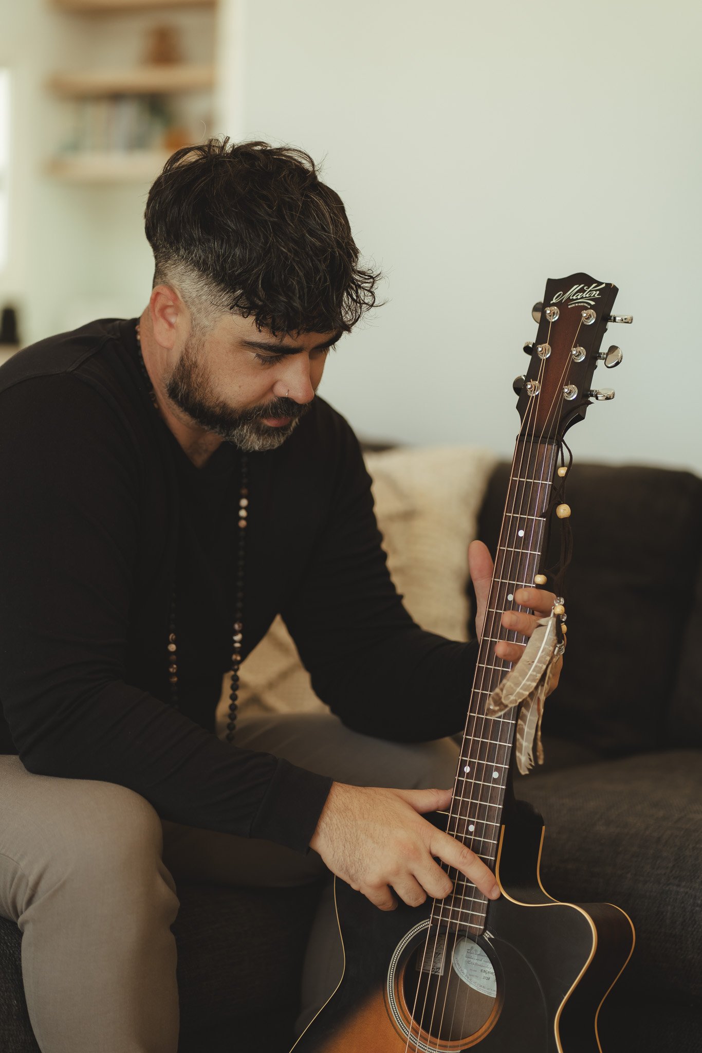
I’m genuinely not sure about this one. I can’t see his face, but do I need to? The clothing choice tells a story, so that’s good. Love the indoor plants. It’s clearly a home studio, so the dude is putting out serious muso vibes. But it doesn’t really give me an idea of what this Artist might sound like on stage. Studio is very different to stage, so this is kind of putting him into a box before I’ve even heard him. I really don’t know. Interested to know what you think.
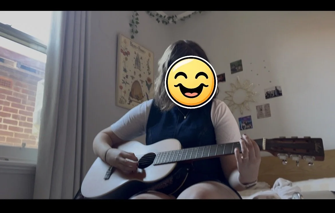
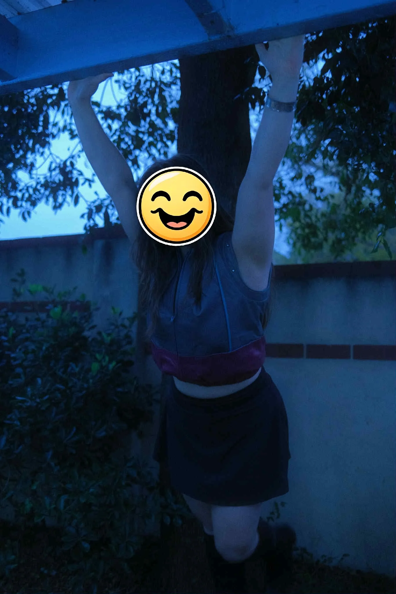
Ok, this is hard to say because the original photo has this lovely smiling young lady enjoying a moment. But this isn’t a promo pic. Kind of grainy, clearly sitting on a bed in a bedroom. It’s not what promoters or potential fans want to see. They want to see you’ve made an effort.
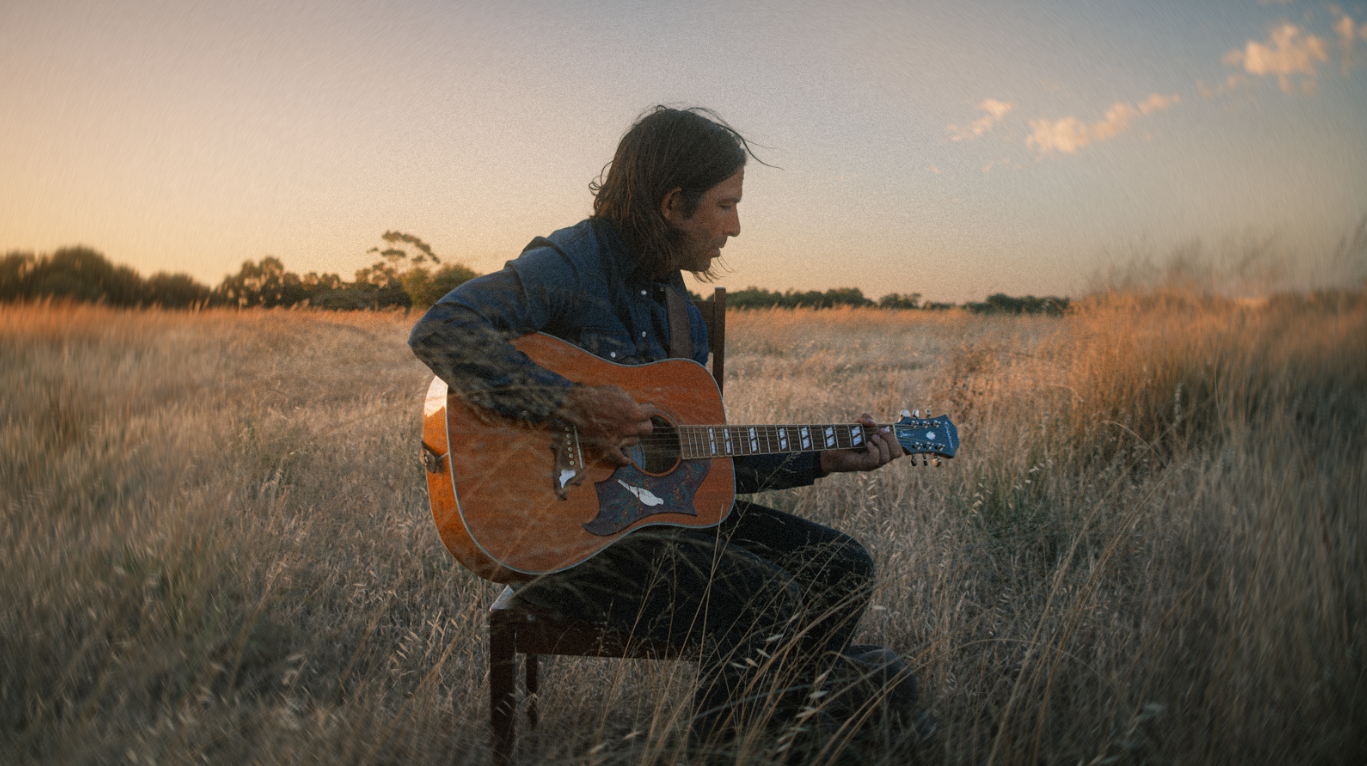
Pretty great really. Awesome lighting. How simple and effective is that location? I want to hear how this Frederick sounds from looking at the picture. Easy to crop into different sizes for various applications.
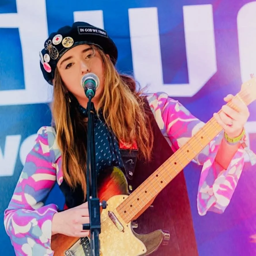
Pretty good really! Great clothing and colour scheme. Shows this person has been on stage before, but man, what a shame we can’t see her whole face. Otherwise it’s ideal.
How simple and effective is this pic!? I reckon it’s great. No need for an exotic location. Captures a moment. Nothing fancy.
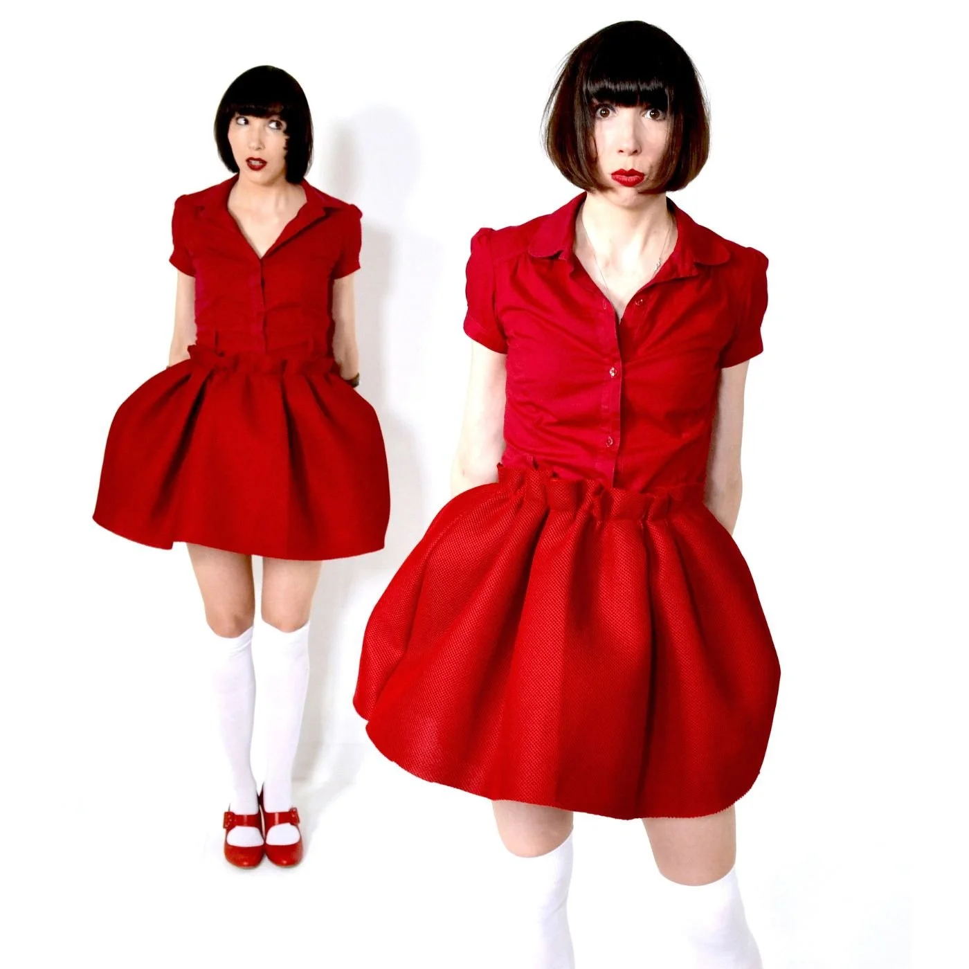
Excellent. No notes. You can already start to imagine how these Artists sound.
Yes. Someone actually sent this through as a promo pic for open mic. No, we didn’t use it.